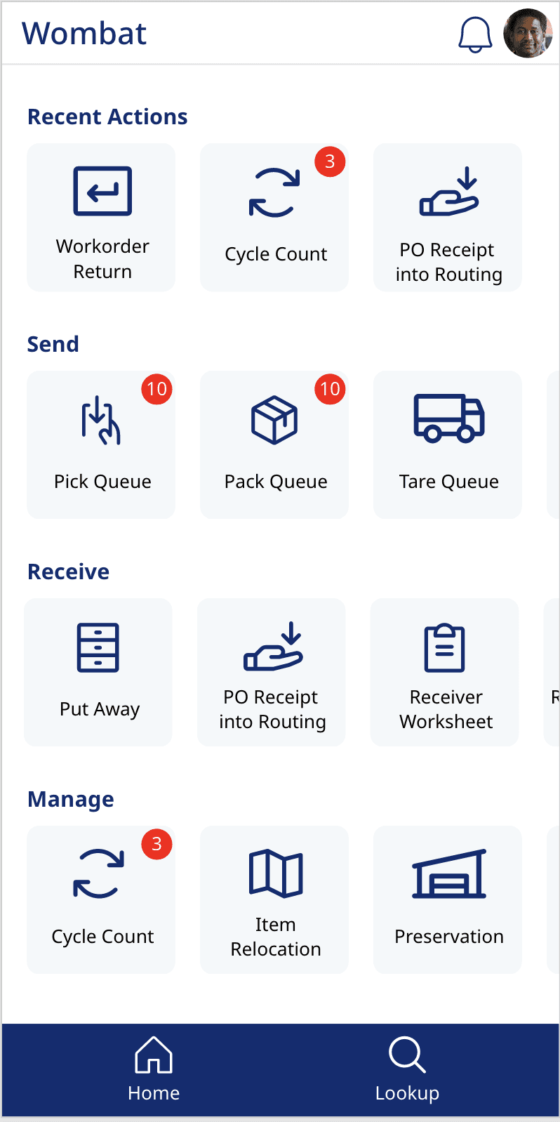
Warehouse workers move fast. The handheld devices they rely on for picking, cycle counting, and inventory tasks need to keep up. Chevron’s existing warehouse application hadn’t. Workers were using outdated hardware with an interface to match: visually dense, inconsistent across screens, and difficult to use while moving through warehouses. As Chevron rolled out new handheld devices, we redesigned the experience alongside them.
I joined the project during its second iteration, working with a lead designer and taking ownership of roughly half of the core workflows. I was responsible for translating research findings into UI decisions, designing components for a new mobile pattern set, and facilitating user review sessions to validate direction and usability.
Building a mobile design system from scratch
Chevron’s Pico design system had no mobile patterns, and there were no plans to develop them at a company level. Everything needed for the handheld experience had to be designed within the scope of this project, alongside the constraints of a hardware rollout.
The research team defined how tasks should function from a workflow perspective, but those steps had not yet been translated into a usable mobile interface. My role was to take those structured task flows and convert them into an interface that worked in a real warehouse environment — one-handed use, fast scanning workflows, and minimal cognitive load while moving.
At the same time, we needed to modernize a legacy interface that relied heavily on manual input, inconsistent page structures, and visual noise that made navigation unclear during fast-paced work.
Two visual directions, one clear path forward
To establish alignment on visual direction, we explored two UI directions grounded in Chevron's existing design language. One leaned toward a more modern interpretation using only core brand colors, while the other preserved more of Chevron's bold visual identity and typography. Stakeholders quickly aligned on a hybrid direction — combining familiarity from the existing system with a lighter, more modern mobile-first structure.
We introduced improved spacing and clearer hierarchy to reduce cognitive load during long shifts. Accessibility was formally evaluated for the first time with many color and text violations found in the legacy app. I also expanded the icon system with more specific, task-oriented icons to reduce reliance on text-heavy interfaces in fast-moving contexts, and replaced Chevron's enterprise font with Noto Sans to support the language requirements for future region support.
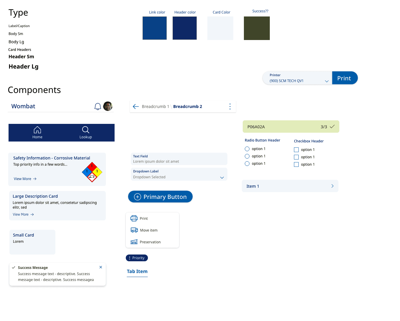
The final direction (left) used Noto Sans — chosen for its language support across Gulf of Mexico and Australian operations — with a lighter, more modern component structure. The earlier exploration (right) preserved more of Chevron's existing brand typography and bolder visual identity.
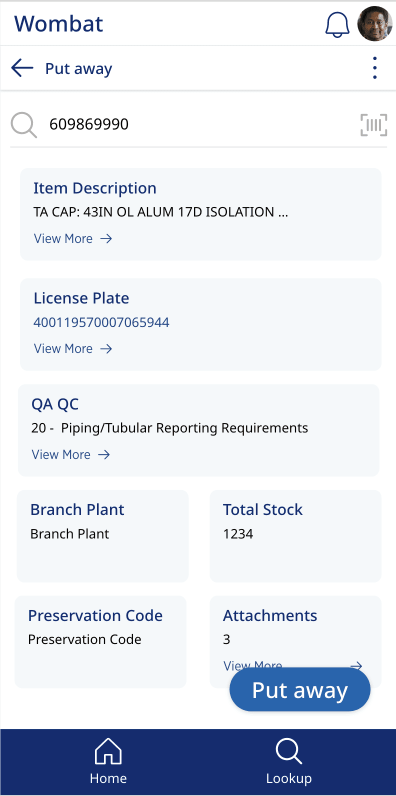
Put away, from scan to confirmation
Put away was redesigned around the scan-first model: workers scan or type a license plate to pull up item details, then step through a lightweight confirmation flow. Item details like QA QC codes, preservation status, and attachments were all surfaced on a single screen — data that previously required jumping between screens and manual input.
Attachments could now be accessed and added directly in the application, replacing the personal device workaround warehouse workers had been using.
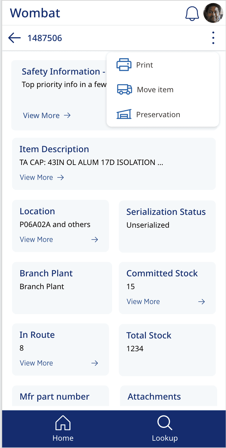
Safety information where it was missing
Hazardous material safety information was introduced into receiving workflows where it had previously been absent. Previously, users had to rely on paper manuals to A dedicated safety card surfaced NFPA hazard ratings and corrosive material warnings directly on the item screen, with a "View More" link for full detail — giving workers the context they needed before handling materials.
The receiving flow also introduced the ability to attach images and documents directly in the application, replacing a workaround where workers had been using personal devices to capture and share documentation.
Print access wherever the work happens
Label printing had previously been accessible only from specific screens, forcing workers to interrupt their flow to complete a routine task. We redesigned print access to be available throughout workflows via the overflow menu, making it a persistent action rather than a destination.
The print bottom sheet let workers select label type, quantity, and destination printer in a single step — and a success notification confirmed the job without requiring workers to leave their current context.
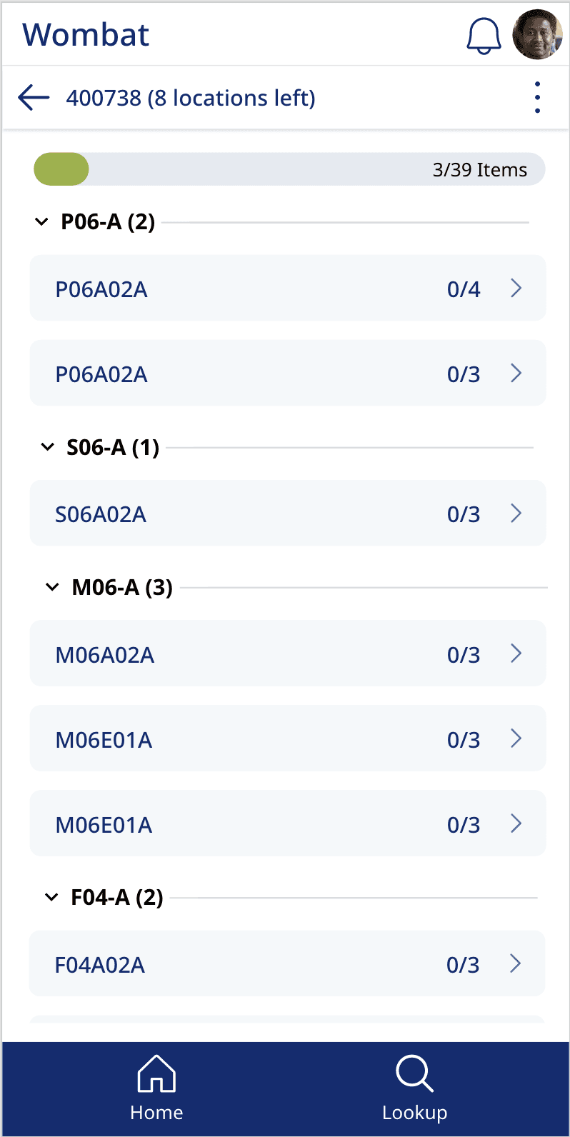
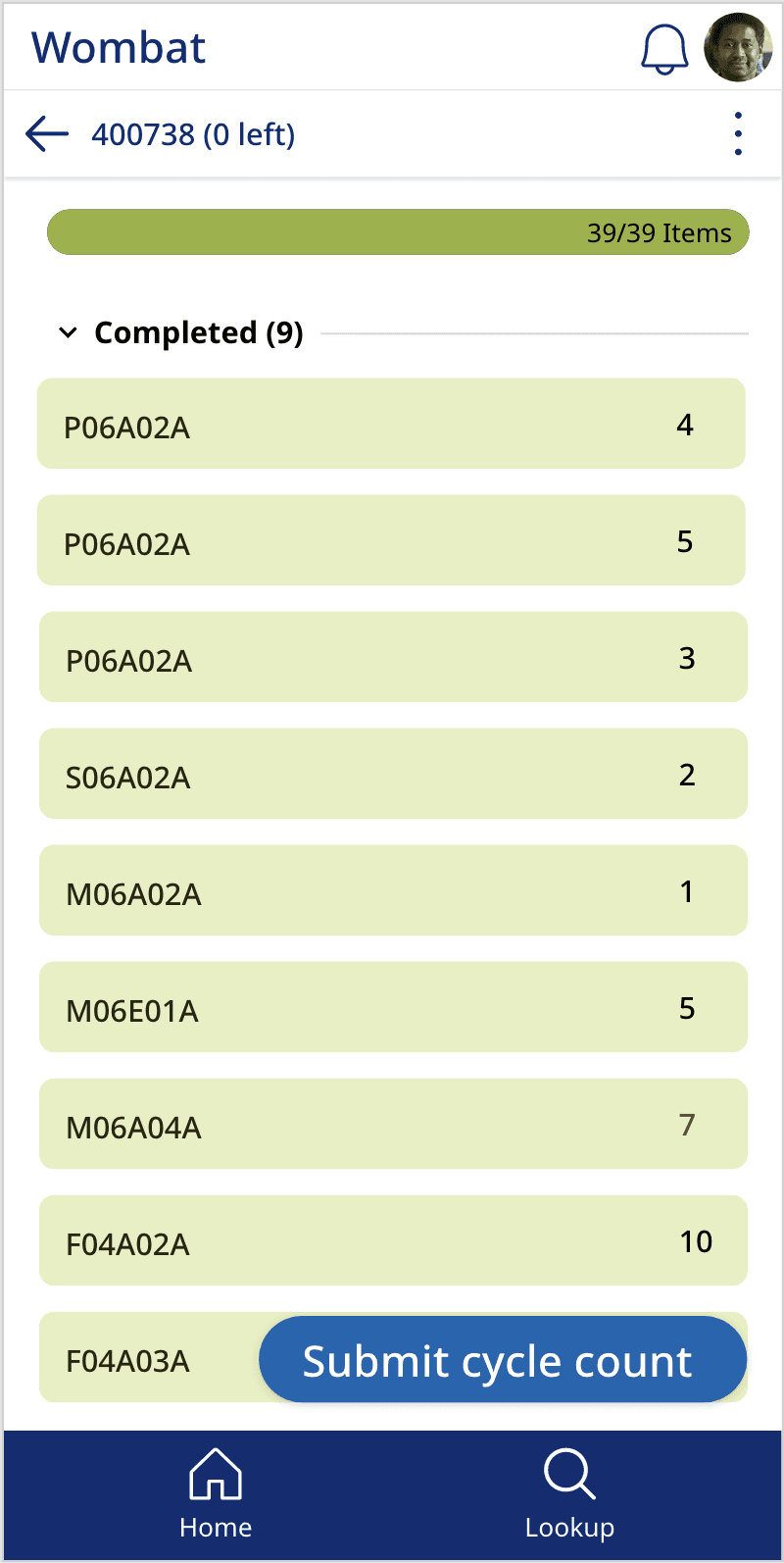
Progress at a glance during cycle counts
Cycle counting required workers to move through multiple locations, tracking progress across dozens of items per session. The redesigned cycle count view introduced a progress bar and item count at the top of the screen, giving workers a clear sense of where they stood without needing to mentally track it themselves.
Locations were grouped and collapsible, reducing visual noise while keeping the full list accessible. Each item row showed its completion ratio at a glance — the kind of fast-scanning structure that made a difference over a long shift in a large warehouse.
20 flows, 6 weeks, two regions
In six weeks, we designed 20 flows covering core warehouse tasks, including receiving, inventory management, and shipping operations, incorporating multiple rounds of user feedback throughout the process.
The new interface significantly reduced navigation confusion and made task progression clearer for warehouse workers, based on direct user feedback during reviews. Stakeholders approved the design direction early, allowing us to move quickly into execution and refinement.
Warehouse workers responded positively to the redesigned experience, particularly around clarity of navigation and reduced manual effort during tasks. Implementation was still ongoing at the end of the engagement, and the work continued into a second phase with another business unit.